Strange Posters for Strange Worlds: Bringing Sets to Life with Digital Decoration

Written by Henry
July 29, 2023
When you have posters on your mind, you start seeing them everywhere. Storefronts, restaurant windows, bulletin boards, and any other vertical surface that lacks advertising otherwise.
For Apocumentary, Luke's short film which is currently in post-production, I was in charge of set design. A huge element of giving each characters' rooms life was posters. The characters featured are all 18-25 year old nerds, and luckily enough, I am also an 18-25 year old nerd. This meant I was able to pull inspiration from my own life for these concepts. For posters, I thought of three different kinds which remain prominent in my memories.

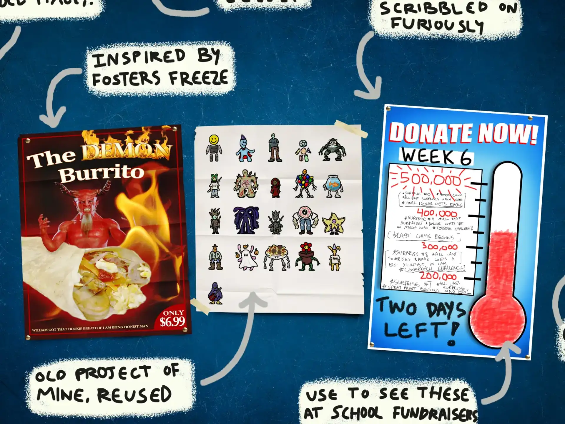
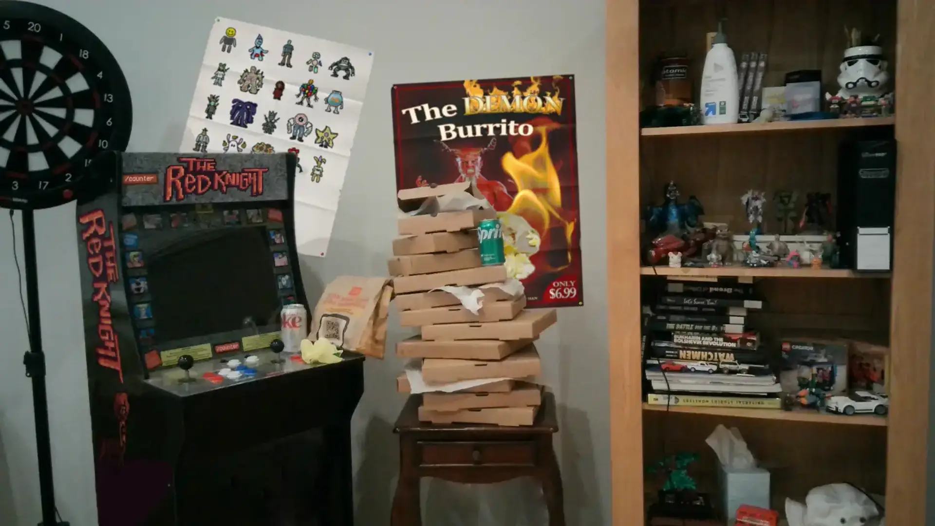
Fast food posters and loud and expressive, with extreme close ups of meals and eye catching color palettes. I have many memories of seeing strange ones at restaurants, and it was always tempting to grab one and convert it into a decoration for my room. For Sam's character, I created a strange food item reminiscent of limited time offer gimmicks from restaurants, with an equally weird poster to match. This poster fit right in with the scene of his room, with his piles of food containers and collectibles which depict a sense of blind consumerism and gluttony.
Alongside the "Demon Burrito" poster, I wanted to feature a video game themed poster to be presented alongside Sam's arcade cabinet. I dug through the archives to find a collection of pixel art characters I created a few years back, as part of a character design study. Their pixelated style was perfect next to the classic game cabinet. With a room that is already full of color and variety, this poster fits right in.

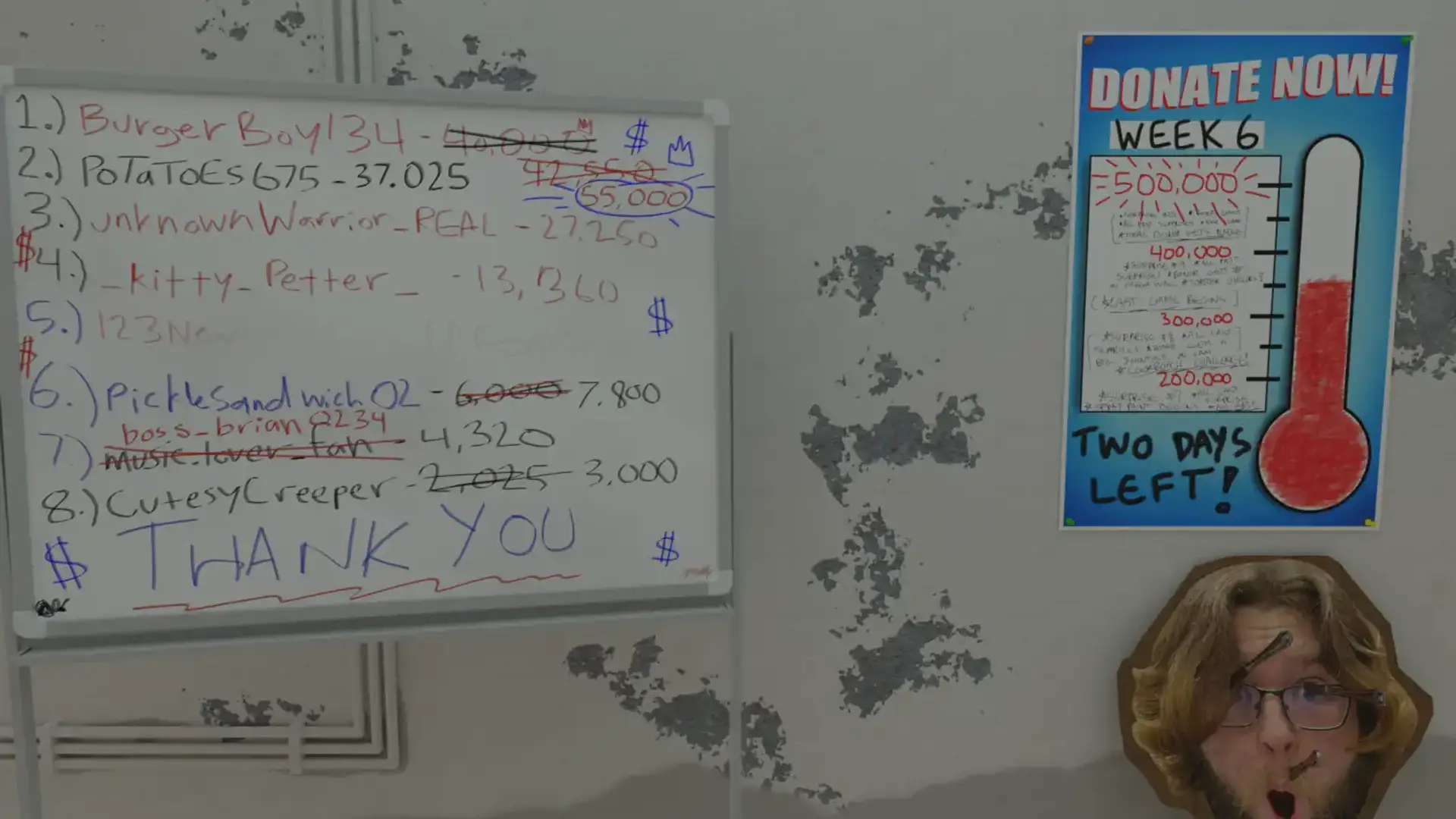
Another character in the film, Sploingus, is an over dedicated streamer who makes a living off of donators who pay massive sums of money to see him suffer. Considering the two main values that fuel his career are money and attention, I designed many elements of his set with desperation in mind. The poster on his back wall is a donation goal thermometer, covered in scribbles that showcase his donation tiers and rewards. The red of the thermometer is scratched in with marker and the writing is rough. The contrast of the clean, store-bought poster with its disheveled additions makes for an interesting piece of décor.

Adding final touches to each set in post has allowed me to consider what fits each character's personality best. With this in mind, I like to think that these posters are reflections of the characters who picked them for their walls.
Thanks for subscribing!
