Website Refresh: Improvements in Design, Editability, and Performance

Written by William
May 12, 2023
Our old website kind of sucked. The typography was weird, the mobile site didn't really work, assets loaded slowly, and the actual content was no longer representative of our best work. As we approached the end of Counter Labor Week, we realized that a new website would be an essential upgrade to move forwards with our business.
For those who missed it, here's a screenshot of the old design. What were we thinking...

To tackle this project, we brainstormed some key features that we would require for the "Minimum Viable Product."
Improved visual design
Easier to update and add content
More versatile portfolio
Faster loading times
Visual Design Upgrades
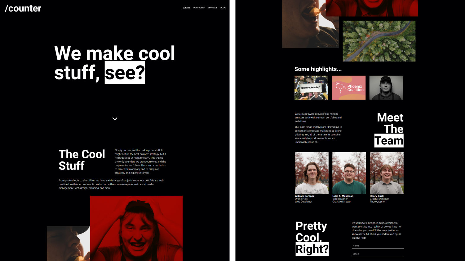
The design component was mostly left to Luke, who came up with an interesting idea incorporating simple bold colors. Over the past few years, an informal color scheme had formed between the three of us. Henry is blue, Luke is red, and myself (William) is green. We doubled down on this idea, and created the following design.
Another neat thing about this design system is how easy it was to leverage into print media. We went on to design a tri-fold using essentially the same layout.
Read more about our print media: Flyers And Brochures: Adventures In Door To Door Sales

Content Management
After two years of using Jekyll and AWS, it was time to grow up and start using a real Content Management System (CMS). We settled on Contentful. The purpose of a CMS is to provide a central location for all your site data and assets. I like to think of it as the "database" for a static site.
Before the content management system, when a developer creates a website they hard code all site content into the HTML. If someone needs a new page, or needs to swap out an image, the developer is required to edit the code of the website.
Using a CMS, the developer simply needs to outline the structure of the website. When content is updated, the site is re-generated using the updated data. For example, a website may have a list of testimonials. The developer outlines how a testimonial should be displayed, where the profile photo goes, where the review goes, etc. Then when the site is updated, it automatically fills in all the testimonials using data provided from the CMS.

This is an example from our site. Notice how the content on the left is translated into the webpage on the right.
The Portfolio
It's wild how long we went without a real portfolio on our website. For some reason we figured it was acceptable to simply link a handful of projects from our landing page. Our goals for the new portfolio page was to be versatile and easy to update.
In addition, we wanted to be able to "dump" a large range of media assets into each portfolio item and for them to display properly without any extra work. To achieve this required some creative rethinking of already existing tools.
To understand our approach to this challenge, it helps to understand the technology stack that we used. Our main site was written in Gatsby, a static site generator for ReactJS. Gatsby works by creating a GraphQL database at build-time into which it pulls all the data needed for building the site from the CMS. Gatsby then outputs a folder full of static files, that can be hosted however you'd like.
We created a React component called "Media." This component is designed so that you can pass in images, GIFs, or videos and it will optimize and display them in the exact same way. This means that when designing the site, anywhere you use a Media component can accept images, GIFs, or videos without any extra work.
Here's a snippet of code from our Gallery component, that creates an arranged gallery of Media components (as seen on each portfolio page).
return (
    <StyledGallery>
        <div>
            {col1.map((img, idx) => (
                <div key={idx}>
                    <Media
                        src={img}
                        videoLoop={true}
                        videoPlaying={true}
                        onClick={onClick}
                    />
                </div>
            ))}
        </div>
    </StyledGallery>
);
If we wanted to support an additional media type, we just need to implement the renderer in our Media component and it will automatically be supported site-wide.
Load Time Optimization
The final hurdle was optimizing load times. As a media production company, our site leans heavily on visual assets such as images and video that can be quite large. Our main approach to solving this problem was using a built in feature of Gatsby called gatsby-image.
The Gatsby Image Plugin provides a React component called GatsbyImage. This component takes any image loaded from the CMS and automatically optimizes the file by exporting it into a variety of different dimensions and converting into a .webp file.
We implemented this feature into our Media component by opting to use GatsbyImage if we detect that the media type is supported.
{isImage(mimeType) && (
    <GatsbyImage image={gatsbyImageData} alt={description} />
)}
This gave us a bunch of cool features for free, such as lazy-loading, placeholder images, and automatic selection based on display size. Using this technique we were able to reduce a 20Mb+ page size down to around 1.3Mb without writing any image optimization code or manually downscaling any images.
The source code for the new website can be found on our GitHub page. As for the final result, you're looking at it! Current bug bounty rates are $1 per reproducible report. Payout is cash only.